Surely if you’re interested in digital design, you would have constantly heard about the importance of good design. You will also know what makes a web design great and useful. But here we are today, shedding light on the opposite. Learning what factors make up a bad design is equally important, as there are minute details that you can skip in your design journey.
In this blog, we’ll discover how you can end up having a bad website design even after struggling to achieve perfection. Also, we’ll show you the 20 worst web design examples so you won’t repeat the same mistakes. So let’s get started in this interesting and fun review of 20 bad website designs.
Understanding the Design Principles: A Short Overview
Mastering the art of beautiful design requires the knowledge of its principles. Plus, design principles help us understand how to captivate the audience through design. While we will discuss the mistakes in the list of bad website designs, there will be much discussion about these elements. So have a look at this short overview of the 12 main design principles to understand these mistakes better:

1- Emphasis
You must concentrate on drawing the viewer’s attention to a certain section of the design arrangement. Artists and designers utilize emphasis to adjust and highlight specific design elements. Color, shape, and size are examples of these aspects.
2- Balance
Visual design aspects have visual weight. The amount of weight each element is designed to bear is determined by its design function and the amount of attention it may attract. Designers use a visual balance to guarantee that their design is equally weighted on each side of a core point.
3- Movement
Movement in your design does not imply a strong flow of elements. It depicts the path a viewer’s eye takes when scanning a composition in design. Motion can be utilized to redirect, focus, and bring attention to a design. A skilled artist may control the entire process using subtle cues, particularly lighting, and perspective. Lines can be used to create directional indications and to bring life to static images.
4- Proportion
Proportion is utilized to establish a connection between two or more design elements. Two pieces are made proportionate to each other to generate a sense of coordination and to make the overall design look aesthetically pleasing.
5- Repetition
Repetition can be defined as anything from a specific font color to a repeated pattern in a social media post. Repetition adds cohesion and vitality to designs. Using a repeating motif that the viewer learns to anticipate also promotes consistency. This makes it quite beneficial for building your individual brand identity.
6- Hierarchy
The organization of the relative importance of the components in your design is known as a visual hierarchy. To make it easier for the viewer to understand your stuff, arrange the facts from most important to least important. This is critical for UI and UX design.
7- Contrast
Contrast is formed when two or more visual elements in a composition are dissimilar to one another. It can be used to create certain effects, emphasize the importance of specific components, and improve the aesthetic appeal of your designs. Experiment with contrasting color shades, shapes, sizes, textures, and typefaces to add interest.
8- White Space
White or negative space is the space between separate items or parts in a design. This section has no animations, photos, compositions, or items. It is a critical design feature that must be properly managed.
9- Rhythm
Rhythm in design brings your design to life by creating the illusion of movement and action. The rhythmic composition also employs the use of lines, shapes, colors, and other aspects. This forces your users to take a specific path when they access your site.
10- Variety
To avoid utilizing the same old design elements over and over again, which is why we employ the diversity concept. It keeps designs from becoming predictable, boring, and stagnant, all of which you want to avoid. Keeping the elements varied avoids designs from feeling uninspired and repetitious.
11- Unity
Unity brings structure to design and makes it feel like a unified whole rather than a disorganized collection of diverse components that happen to be on the same page. It is conceptually and visually developed. It can only happen when all of the design components work together to create a seamless, aesthetically beautiful experience.
12- Pattern
A pattern comprises various parts that are repeated similarly, as opposed to repetition, which occurs when the same elements are repeated throughout a design. A pattern can be seen in how gift wrapping frequently consists of a few different elements that are repeated.
What Factors Make up a Bad Website Design?

A poorly designed website can be a real turn-off for users. So, what factors contribute to a bad website design? Let’s take a look:
1. Cluttered Pages
Imagine opening a website and being bombarded with a messy mix of data. Cluttered pages with abundant content, graphics, and features might confuse visitors and make it harder for them to find what they want.
2. Slow Loading Speed
Patience is a virtue but can wear thin quickly when confronted with a slow-loading website. Users demand instant access to information, and if your site takes a long time to load, they will most likely leave and choose a faster option.
3. Design Is Not Mobile-Friendly
In today’s mobile-first world, having a website that adapts to numerous screen sizes is critical. If your design is not mobile-friendly, mobile users will be frustrated, resulting in a negative user experience and missed chances.
Learn about Mobile commerce through our guide.
4. Wasted Whitespace
Whitespace is your ally! It creates a clean and well-organized layout, allowing the material to breathe and boosting readability. Too much whitespace, however, without correct balance or purpose, can make a website appear unfinished or incomplete.
Learn 22 Tips That Will Increase Online Sales For Your Business.
20 Examples of Bad Website Design That Will Shock You!
Time to jump right into the flaws and issues in 20 websites that will leave you amazed.
- Zara’s Unconventional Navigation
- Flashing Web Design of Blinkee.com
- Wayfair’s Lack of Visual Hierarchy
- Simcast’s Poor Color Scheme
- Dull Pages of Berkshire Hathway
- Craigslist’s Outdated Design
- Boring Web Design of Acme Laboratories
- eBay’s Complex Product Pages
- Madewell’s Unclear Mobile Navigation
- IMDB’s Cluttered Layout
- Yahoo’s Problem With Whitespace
- CNN’s Load Time
- NYU’s Color Combination
- Readability Issues With Hacker News
- Color Explosion of Penny Juice
- Accessibility Issues With ODC/Dance
- 70s Design of Ling’s Cars
- Hidden Issues in Connection
- Bland Web Design of 4Chan
- Disrupting UX of Daily Mail
Note: Our attempt is not to roast or degrade anyone’s website. We just want to show some minor details to readers that make up a bad website design and save them from disasters.
1) Zara’s Unconventional Navigation
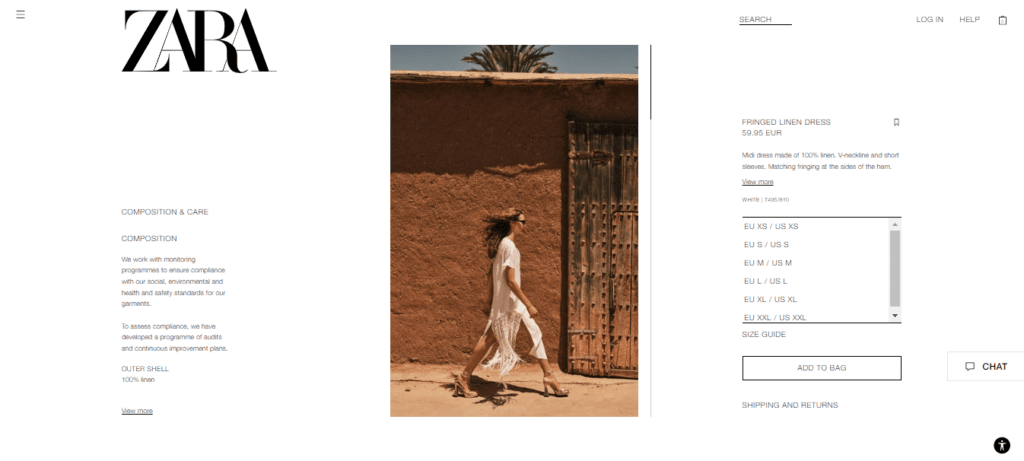
You might be shocked to hear that such a unique and famous brand like Zara is at the top of our list. Well the thing is, when you open their website, it looks like you are scrolling through an editorial magazine. For such a famous brand as Zara, having a website that’s not easy for users to navigate is not so great.
It’s visually appealing but isn’t shopping-friendly, that is the main goal of users. The text on their homepage is small, and the navigation menu is hidden behind a hamburger button. Visitors may get confused or frustrated without an explicit call to action.
The user experience on ZARA’s mobile site is equally tough to follow. When you click on the hamburger menu on mobile, an unusual navigation menu appears. It’s worth noting that there is no “Clothing” option. Instead, visitors must browse a large list to find what they want. So considering all these factors, Zara’s website is a thumbs down for us!
2) Flashing Web Design of Blinkee.com
Look at this bright and shiny homepage of blinkee.com that looks like someone hung up Christmas lights. Although this website sells body lights, that doesn’t mean making the whole interface look like a Christmas tree. Remember we said how whitespace is important for a web design. Well! This is an example where the designers forgot to use whitespace properly.
You must leave space between elements so your users are not confused with such a bright interface. Simply put, their interface is not up to the mark and might disappoint many users.

3) Wayfair’s Lack of Visual Hierarchy
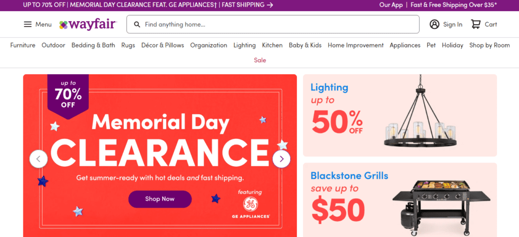
Open Wayfair’s homepage, and you will face tons of options to shop at the same time. Unlike Zara, Wayfair provides many options on its web pages, but the problem here is the visual hierarchy. All the buttons and elements are of the same size. Thus, users cannot pay attention to one single element at a time. Hierarchy helps to give your users a sense of direction and where their actions will be headed. But in Wayfair’s case, they haven’t played right with the hierarchy and user-friendliness.
4) Simcast’s Poor Color Scheme
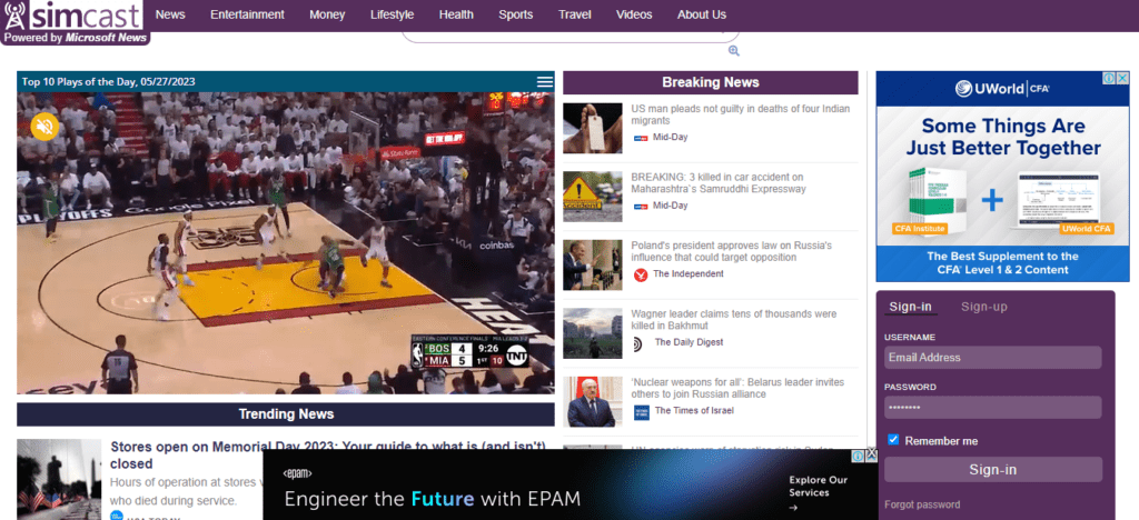
You’ll be surprised to learn that Simcast News Portal, which is powered by Microsoft, is on our list of bad website design. The problem with this website is its poor color scheme and outdated choice of design. Also, it has cluttered text which makes navigation on the website difficult. This website most definitely fails to grab users’ attention but can be improved with some changes. It needs fewer ads, a better color scheme, and a more modern interface to stand out.
5) Dull Pages of Berkshire Hathway
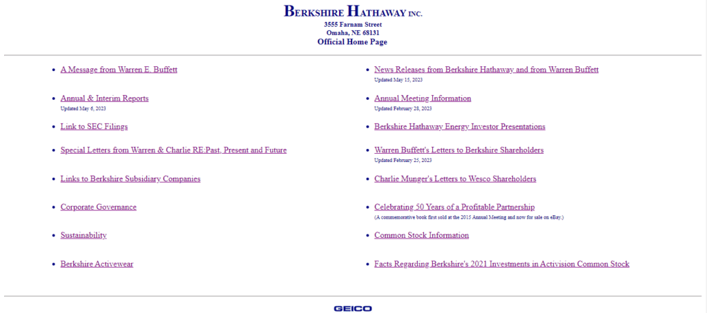
Next up on our list is the popular Berkshire Hathway’s website that is Waren Buffet the business magnate’s company. One would expect such a famous company to have a modern website, but that is not the case, as seen in the image below. The whole design of the website is very dull, with no images, no hierarchy, and a very basic and minimal design.
Now we are all in for simplicity and minimalism in design, but there is a healthy balance that you need to achieve. You cannot expect a website as dull as Berkshire Hathaway to earn credibility and grab users’ attention. If you have a popular brand belonging to such an influential company, you need to have a unique interface that competitors cannot easily replicate.
6) Craigslist’s Outdated Design
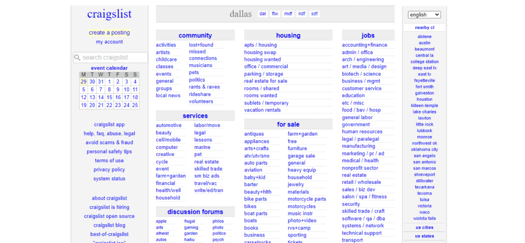
The infamous Craigslist has somewhat of an untrustworthy reputation. Well, the website adds up to this untrustworthy reputation. As you can see, it has a similar design and interface to Berkshire Hathaway. No content, no images, and an outdated interface, all of these combined make a website look unreliable and fake. So dear readers, do not make these mistakes in your web design.
7) Boring Web Design of Acme Laboratories
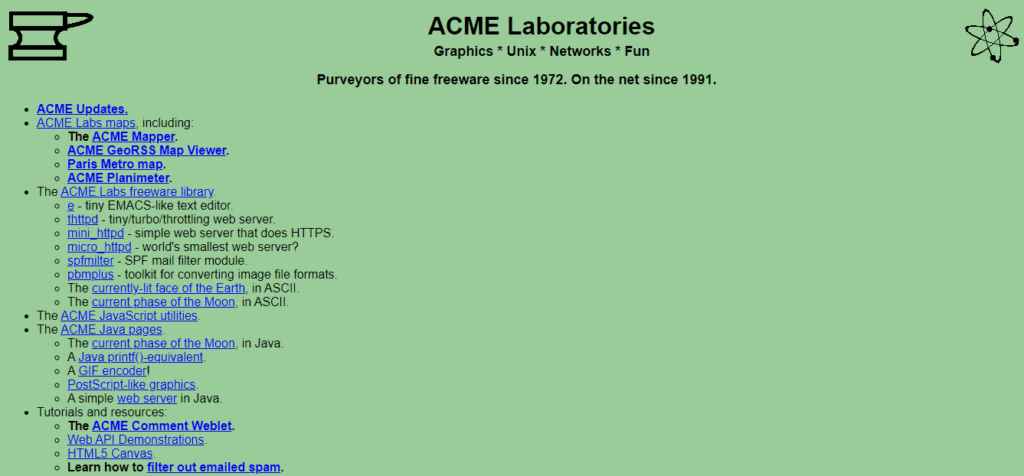
Let’s have a look at another boring and old web design of Acme laboratories. The company has been around since 1972, and its design looks no younger. The problem here is along with a boring design, they have too little content on the page and just a bunch of highlighted links.
Even though a company’s main revenue source is not its website, it should still have a decent layout and interface. The reason is that websites have become a daily part of everybody’s life, and stats show that internet users visit over 130 web pages in the US daily. So if it is not about conversion, it should be about relevance. A person might come to your website to get information about your products and services, and an interface like Acme doesn’t do justice to that user goal.
8) eBay’s Complex Product Pages
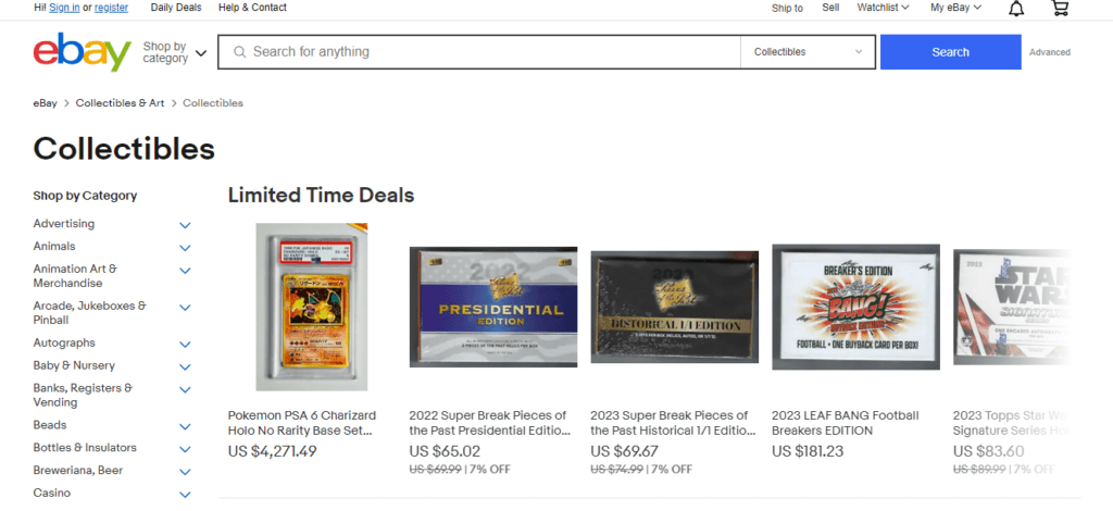
On platforms like eBay, customers come to get all the possible information about a product before purchasing to trust it. The problem with eBay’s website is that it provides too much information on one page. If you click on a product of your liking on eBay, you will see the item’s name, price, condition, quantity available, and numbers sold, as well as shipping, payment, and return information — all on a single page. When you scroll down, you’ll see another toggled section with further description and information on shipping and payments.
Another problem with their product pages is having multiple CTAs on the same page. You have to buy the item, add it to your cart, or save it to your watchlist, all on the same page. This might confuse users about which action to take. This is a very bad practice, and every ecommerce website should avoid it.
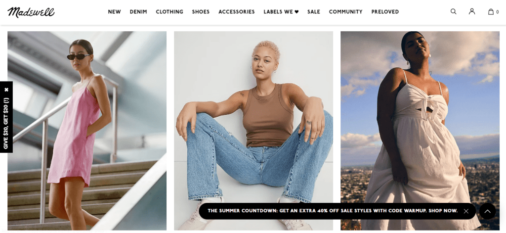
9) Madewell’s Unclear Mobile Navigation
Madewell is another example like Zara on our list, but the problem here is in their mobile app. Mobile website traffic constitutes 58.33% of overall website traffic globally. So it is crucial to impress customers approaching you through mobile. Madewell’s mobile website interface doesn’t strike the right balance of easy navigation and information users need.
Their website layout is clean and sleek but lacks some essential features that make it fall under the list of bad website designs. They need to make their website responsive for different devices so customers have an easy user journey.
10) IMDB’s Cluttered Layout
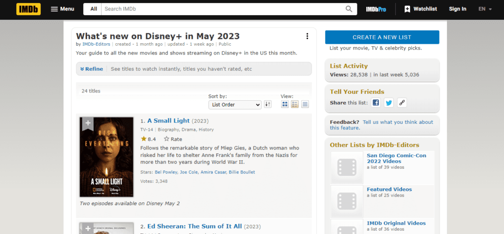
IMDB’s website has numerous web pages with information on nearly every movie. Although IMDB has often redesigned its pages, some pages are left with UX pain points. The problem is that there is little whitespace and color, fonts are too small, and too many irrelevant ads appear. Also, their navigation isn’t easy as you have to continuously scroll across sections to find your desired information. IMDB should change its layout and add drop-down menus, so it is easier for users to access information.
11) Yahoo’s Problem With Whitespace
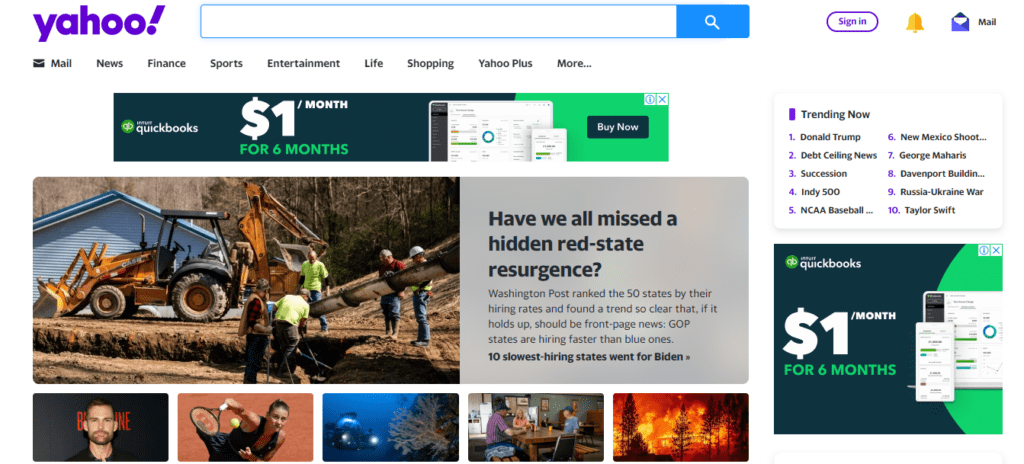
Yahoo is another bad website design example guilty of using outdated design. Yahoo has been criticized for not keeping up with the times. Some users have complained that the UI is crowded with ads and unnecessary components, making it difficult to discover what you’re looking for.
Slow performance is another cause of annoyance for users. Waiting for pages to load or dealing with sluggishness throughout the site can be frustrating, especially when checking emails, reading news items, or exploring other services. It’s annoying when a website appears to be taking time to stroll while you’re in a rush.
12) CNN’s Load Time
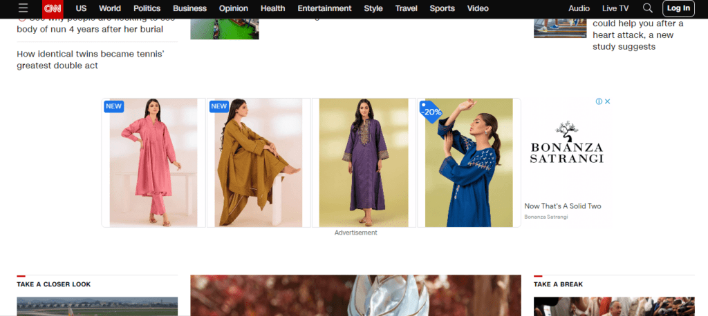
Seems like CNN doesn’t pay attention to the importance of website scannability. Slow loading times are a website’s enemy, as more than half of mobile website users leave if it takes more than three seconds to load. CNN is another platform like Yahoo that is intended to provide a wide range of content, including images, videos, and text.
However, the page is large and takes a long time to load. Speedmonitor.io ranks it as one of the top ten slowest websites on the internet. CNN is likely losing visits and positions on search engine results pages (SERPs) due to its speed, which is critical to the user experience and search engine rankings.
Learn the Importance of Website SEO.
13) NYU’s Color Combination
You would expect a design for a university website that makes all the information easily available to students. As you can see in the image below, this website has only one color throughout. Although there are different shades of purple, .
Furthermore, because the grid layout contains some graphics but is mostly blocks with a solid background color and some text, it appears that the web page isn’t fully loaded. More images would help to prevent this misperception and offer readers valuable context.

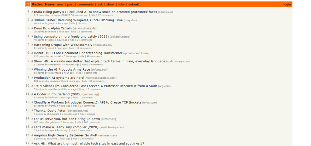
14) Readability Issues With Hacker News
Hacker News is the go-to source for cybersecurity-related news. This website has a lot of readability issues, and considering it’s a news website, it should never have such an interface. For example, each item in the list has a button that allows you to upvote, sort by website, read the submitter’s profile, sort by the time they posted it, comment, or go to the story. However, the font’s small and muted color and the lack of whitespace, icons, and hover effects make it difficult to distinguish that these are independent operations.
15) Color Explosion of Penny Juice
Penny Juice looks like a harmless children’s website at first. But the colors on this website look like a color bomb exploded. Needless to say that their font choices are also horrible. They could have chosen one of the best fonts for websites like Optima, Roboto, Helvetica, etc., but they chose too bright and hard fonts.

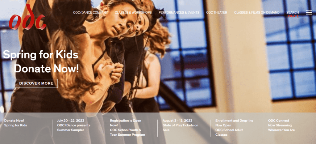
16) Accessibility Issues With ODC/Dance
Coming to another factor that greatly influences the success of a website is website accessibility. This site lacks the accessibility factor. This can limit this website’s ability to reach a broader audience or rank in search engine results. A video automatically plays on the homepage. While this is interactive and engaging but according to WCAG rules, it should feature controls that allow the user to pause or stop playback.
Furthermore, there are some color accessibility difficulties on the site. The image background obscures some of the headline and CTA information in the screenshot above. The white text is difficult to read because the navigation bar and banner at the bottom of the screen are partially transparent. This may prevent users from clicking on CTAs or navigation links or remaining on the site.
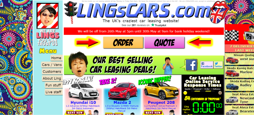
17) 70s Design of Ling’s Cars
The image below shows a website that is rather funny and extremely colorful. This is definitely a bad website design, and you should never create something like that unless the trends change. This dreadful website will give you a taste of the 1970s. The neon backgrounds and music that Helen Keller would have seen and heard.
The website aims to sell vehicles for lease, but with the trotting chickens and Dalek webcams, you won’t be able to spot any. Complete chaos rages throughout the website, obscuring the content and services provided by Ling’s Cars. This should never be the way to promote an online store.
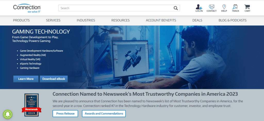
18) Hidden Issues in Connection
When you first glance at Connection, you’ll see a normal website with a relatively good layout. This is a sleek and modern website. It is not as much of a bad website design as some of the other selections on this list. However, when you try to use the website, problems begin to emerge. There is a noticeable shortage of whitespace, which might make touchscreen navigation difficult. The content is not organized in an optimized manner, resulting in a cluttered surfing experience. However, the problem is simple to resolve. The owners only need to add additional space to give the website some breathing room.
19) Bland Web Design of 4Chan
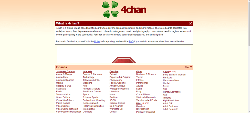
4chan is a simple website where people can post comments and share images on various topics. A website that is made for such engaging purposes should have an interface and layout that keep users hooked to platforms like Facebook and Instagram. But 4chan lacks all of it. This appears to be a white page rather than a website. It does not look like a trustworthy website at all. You’re just flooded with connections to various pages.
20) Disrupting UX of Daily Mail
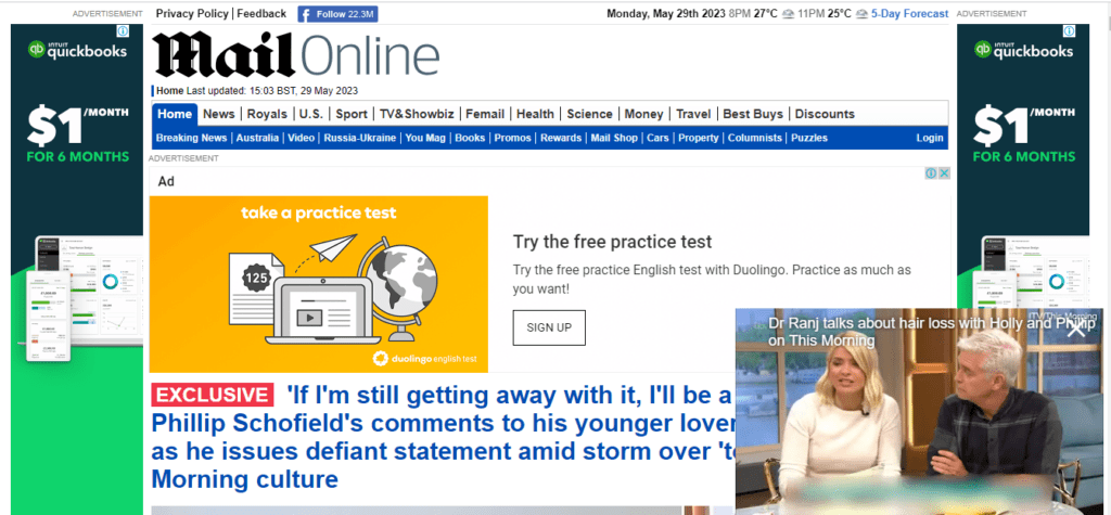
Advertisements play a crucial role in the online ecosystem, enabling websites to offer users free content while generating income through affiliate partnerships and product sales. Completely eliminating ads is an impractical task, so the focus shifts to presenting them in a manner that minimizes disruption to the user experience.
However, The Daily Mail website falls short of achieving this goal. The placement of ads within the main body of the webpage and in the sidebars creates a cluttered appearance that pushes down the content. This will lower readability for users. Also, these ads noticeably impair the website’s loading speed, further detracting from the overall user experience.
Want to learn how to create good ecommerce website designs? Read this guide on eCommerce Website Design | Best Tips And Examples 2023.
Save Your Web Designs From Disasters!
Fewww! That’s it from the long list of bad website design examples. You mustn’t have expected such famous brands to be a part of this list. But that’s the thing! Companies take the importance of good website designs for granted. Now that you know what simple mistakes can make or break your web design, you must avoid them in your own design projects.
Shopsmith is always here for you if you want the best website designs and maintenance. We have a team of experts and professionals with a proven record of successful projects that can transform your web design. Reach out to us whenever you need solutions to design problems!
FAQs
What are the main characteristics of a poorly designed website?
The main characteristics of a poorly designed website are:
1. Cluttered and disorganized layout
2. Lack of clear navigation and structure
3. Slow loading times
4. Inconsistent or outdated design elements
5. Poorly chosen color schemes or fonts that are hard to read
6. Excessive use of animations, graphics, or ads that distract from the content
7. Lack of responsive design, leading to a poor experience on mobile devices
8. Broken links or missing images
9. Insufficient or confusing content, making it hard for users to find information
10. Lack of accessibility features for users with disabilities
How to check if your website is good or bad?
To check if your website is good or bad, you can use the following tools:
Google PageSpeed Insights
GTmetrix
W3C Markup Validation Service
Responsinator
WebAIM’s WAVE Evaluation Tool
Google Analytics
UsabilityHub
Browser Developer Tools

